Data visualization makeover in ggplot2: Inflation rate after devaluation in Kazakhstan
Introduction
A bit of history: in 2014, Kazakhstani tenge (KZT) devaluated from 150 to 185 KZT for 1 US Dollar. The current currency rate is 435 KZT. Local media Vlast conducted an interesting experiment: they measured prices right after the first devaluation in February 2014 and in April 2021 to compare inflation with devaluation rate. They shared both the data and a chart.
While looking at this chart, the only thing that I understand is that some products are more expensive, especially meat, which looks like an outlier. I can’t answer if the devaluation affected inflation. And how much? For which products?
So I decided to build another data visualization as the experiment itself is exciting!
Ideas
Grouped bar chart to compare prices side by side
df %>%
    mutate(
        period = ordered(period, levels = c('before', 'after')),
        product = reorder(product, -price)
    ) %>%
    ggplot(aes(x = product, y = price, fill = period)) +
    geom_bar(stat = 'identity', position = 'dodge') +
    labs(
        x = '',
        y = 'Price, KZT',
        fill = ''
    ) +
    scale_fill_manual(values = c('#b0bbc2', '#118fcf')) +
    theme_bw() +
    theme(
        legend.position = 'top'
    )
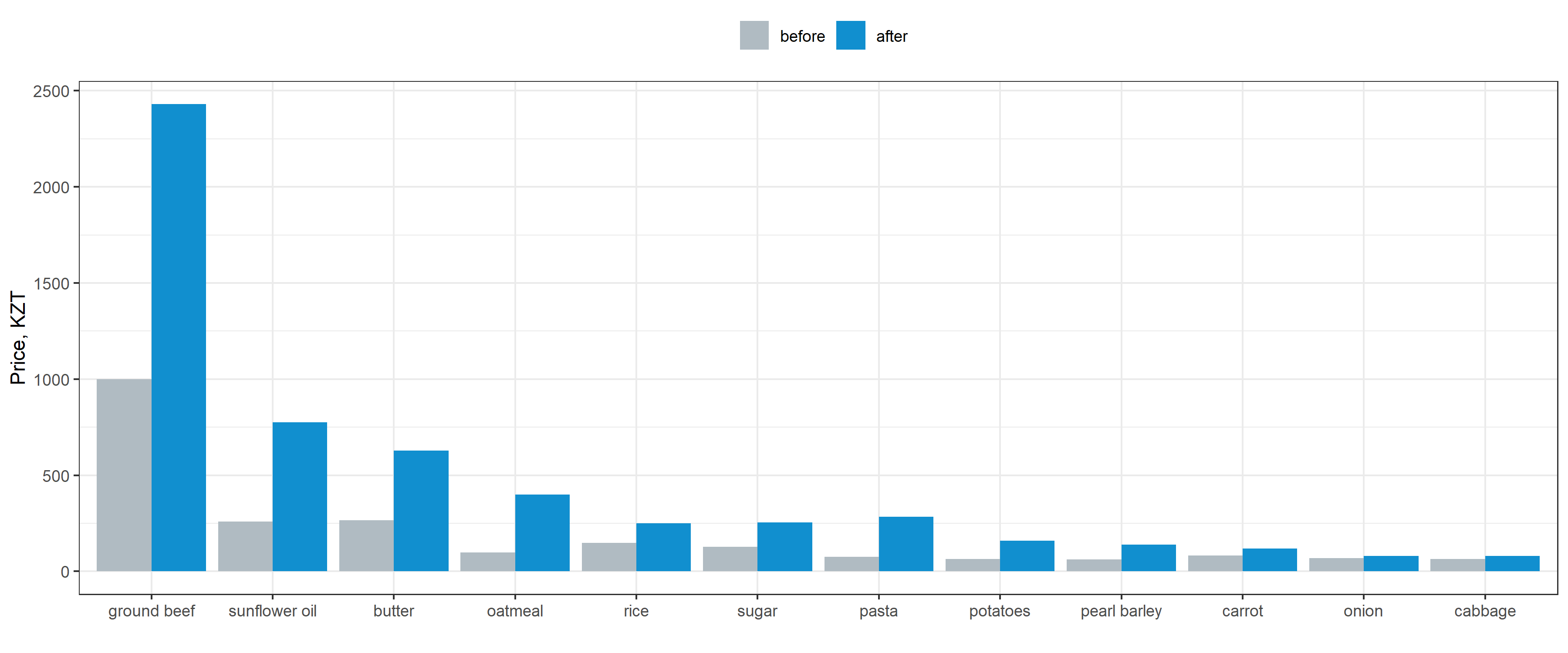
Pros
- Clear comparison of prices before and after
- Sort from the most expensive to the cheapest product
Cons
- Hard to see the relative difference
- Focus on prices themselves and not on their changes
Bar chart with relative price change per product
df_difference %>%
    ggplot(aes(x = product, y = difference)) +
    geom_bar(stat = 'identity', width = .7, fill = '#118fcf') +
    geom_hline(aes(yintercept = 2.6), alpha = .5, size = 1, linetype = 5, col = '#2c3b3c') +
    geom_text(aes(x = 1.15, y = 2.6, label = 'Devaluation'), vjust = -1, size = 6) +
    theme_bw()
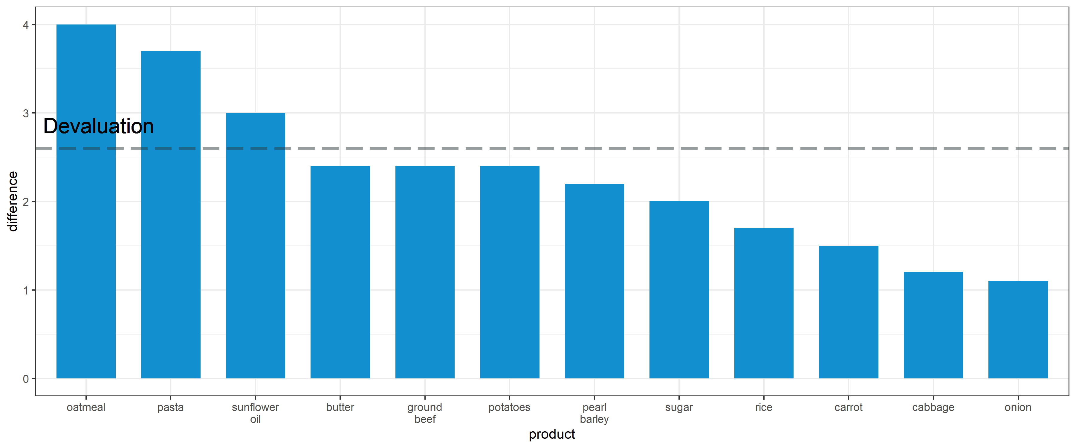
Pros
- Focus on products with the highest inflation rate
- Comparison of devaluation rate and inflation per product
Cons
- Missing labels for each bar for better readability
- Chart noise like black borders or panel grid
So, let’s make our chart more insightful!
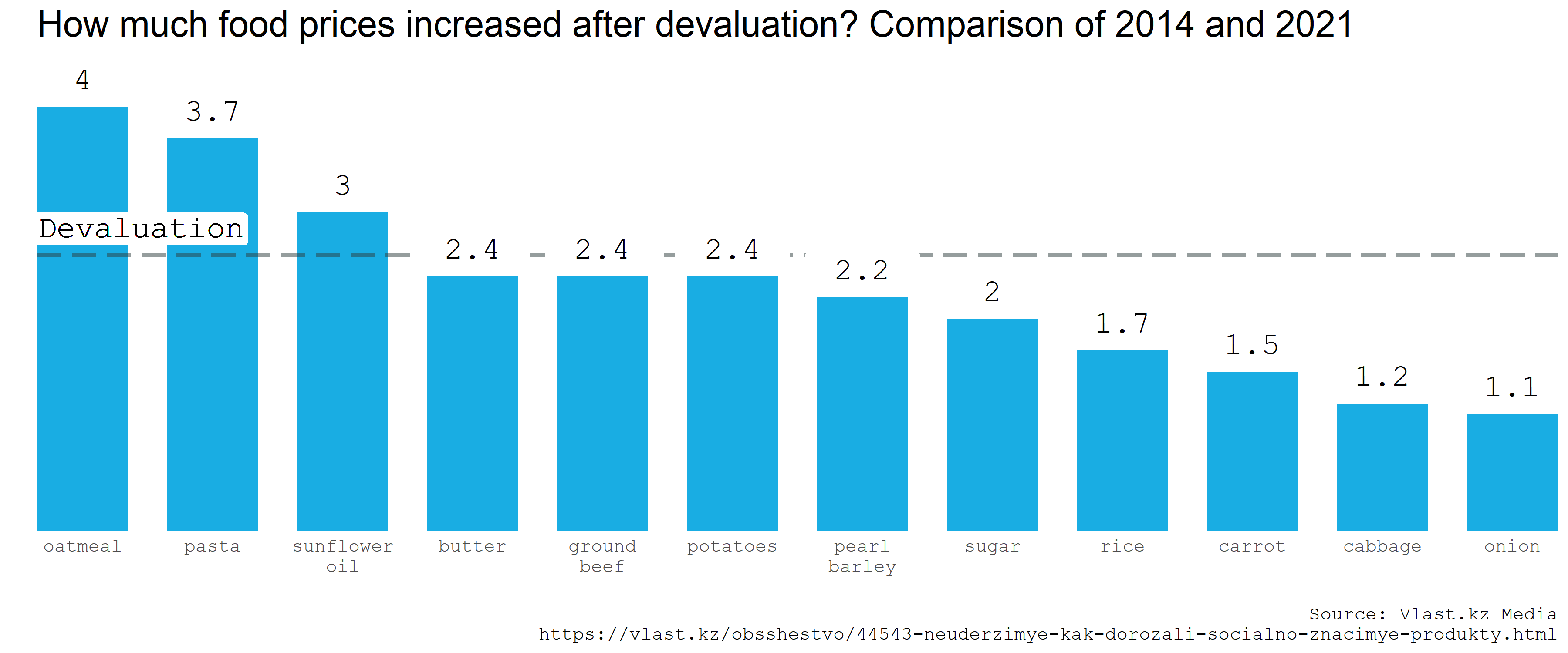
Making the chart more clear
I took several steps:
- Added labels. A lifehack: use
geom_label(colour = NA)to add a background forgeom_text(). It removes a border and a text from the label. - Extended Y axis, so all the labels are inside the chart. You can use
coord_cartesian(clip = 'off')too, but in this case, it wasn’t enough. - Removed excessive axis labels, added a clear title
- Replaced
theme_bw()with customtheme()to remove noise such as panel grid, axis ticks and borderline - Played with fonts a bit
- Added cite
Voila!
df_difference %>%
    ggplot(aes(x = product, y = difference)) +
    geom_bar(stat = 'identity', width = .7, fill = '#19ade3') + # Bar chart

    geom_hline(aes(yintercept = 2.6), alpha = .5, size = 1, linetype = 5, col = '#2c3b3c') + # Reference line, devaluation rate

    geom_label(aes(x = 1.45, y = 2.6, label = 'Devaluatio'), vjust = -.3, size = 6.5, colour = NA, family = 'mono') + # Background for geom_text() to overlap bars
    geom_text(aes(x = 1.45, y = 2.6, label = 'Devaluation'), vjust = -1, size = 6, family = 'mono') + # Legend for a reference line

    geom_label(aes(x = product, y = difference, label = difference), vjust = 0, size = 11, colour = NA, family = 'mono') + # Background for geom_text() to overlap reference line
    geom_text(aes(label = difference), vjust = -1, size = 6, family = 'mono') + # Text labels

    scale_y_continuous(limits = c(0, 4.5)) + # Extended Y axis

    labs(
        title = 'How much food prices increased after devaluation? Comparison of 2014 and 2021',
        x = '',
        y = '',
        caption = 'Source: Vlast Media\nhttps://vlast.kz/obsshestvo/44543-neuderzimye-kak-dorozali-socialno-znacimye-produkty.html'
    ) + # Title, axis labels, caption

    coord_cartesian(expand = F) + # Remove white space before the first bar for better alignment
    theme( # Custom theme
        plot.title.position = 'panel',
        axis.ticks = element_blank(),
        axis.text.y = element_blank(),
        panel.background = element_blank(),
        panel.grid = element_blank(),
        plot.title = element_text(size = 20, family = 'sans'),
        text = element_text(size = 13, family = 'mono'),
    )
You can find the full code in this Jupyter Notebook and the data here.